The Great Author Photo Debate of 2015
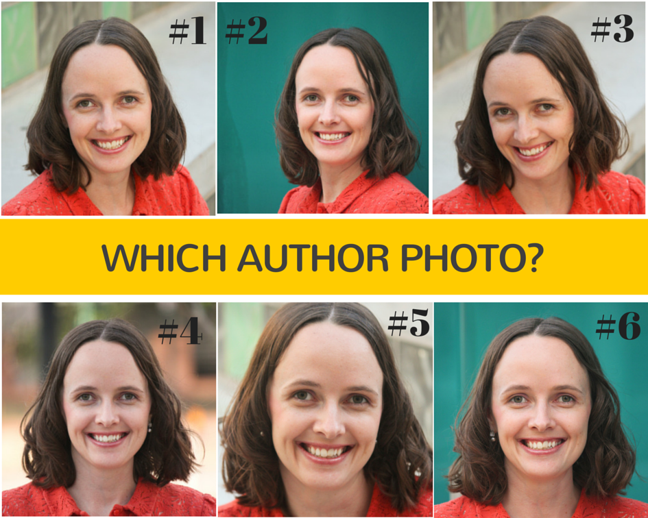
It was a Sunday night. I’d spent 2 hours editing and cropping possible author photos, and I had 6 that I liked. And honestly, I hadn’t the least idea of which photo I should use–I was too close to the project, sick of staring at my own teeth.
So I decided to crowd source.
On Monday morning, I posted the following to Facebook. My husband reposted it to his page and to Twitter.
Responses poured in, and since I’d posted it as Public, plenty of people I’ve never met voted. And everyone had opinions. I compiled the results in an Excel file.
217 people voted. 64 people (29%) voted for more than one photo.
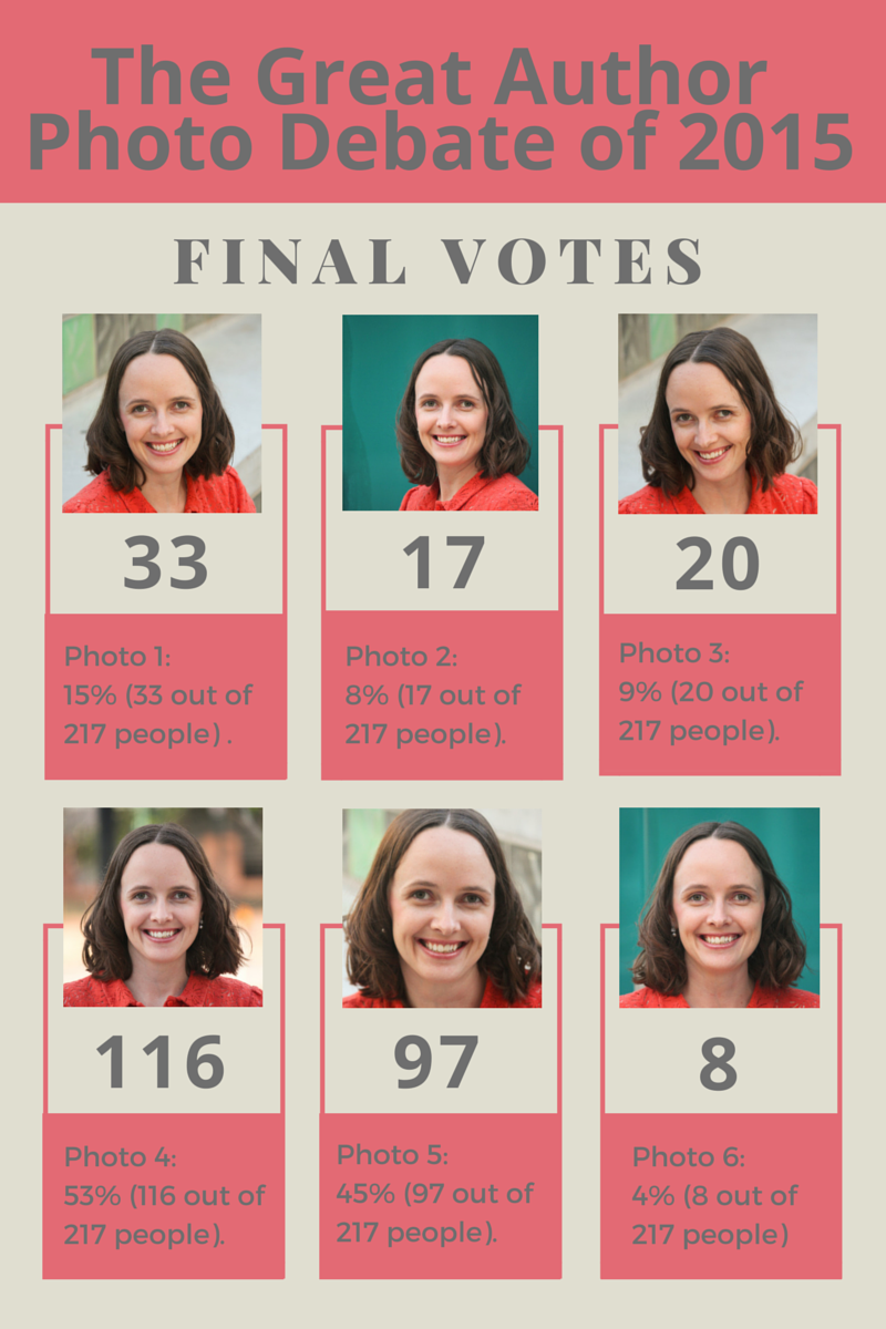
The final votes:
But despite the votes, I still wasn’t sure which photo to choose.
After all, I never said I would choose the photo that had the most votes. And photos 4 and 5 had a close number of votes, with some things making me lean towards photo 5 (several editors from a publishing house and someone who arranges author visits both put photo 5 down as their top choice). Also, it wasn’t the best poll from a scientific standpoint, as people could see what others had voted and it may have subconsciously impacted some people’s decision. (I intentionally didn’t do an official Facebook Poll, because then people could constantly see the final count, instead of just what the last few people had voted.)
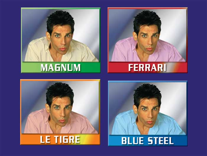
In a helpful move, one of my friends gave me some pop culture advice.
He told me “Blue Steel.”
Oh, yes, from the film Zoolander. Is it really possible to choose the best Ben Stiller, especially since the photos are so drastically different?
Also, he sent me this amazing clip from the film Ten Things I Hate About You. You can skip to about 36 seconds in.
The real question, then, is if I wanted to be pensive or thoughtful.
As many people pointed out, different photos create different meanings, and impact the way people will interpret me as an author. But there was a diversity of interpretations for any given photo.
I decided to do a test and see what the photos looked like on the web.
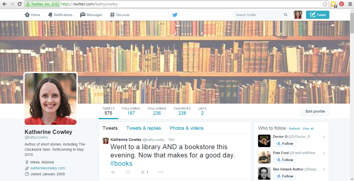
I turned to Twitter, since I have a small audience and followers don’t get a notification when you switch your photo.
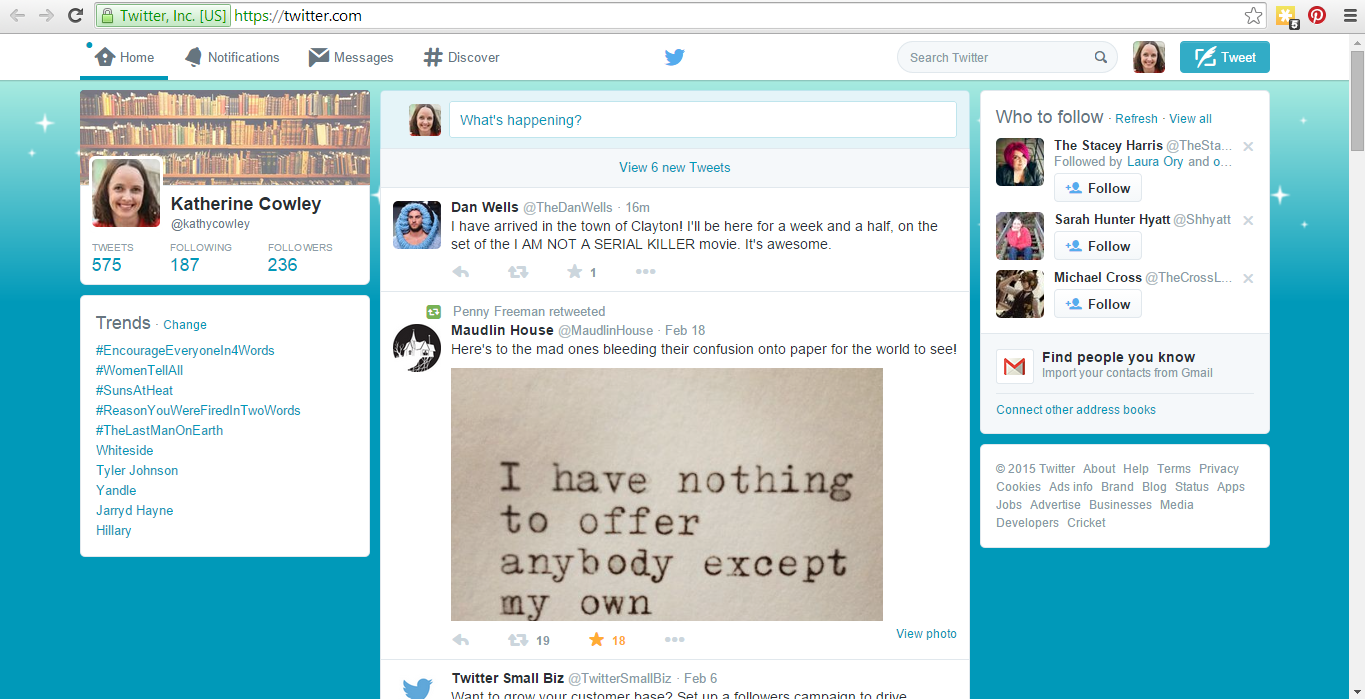
Photo 4 on Twitter:
And when it’s shown smaller:
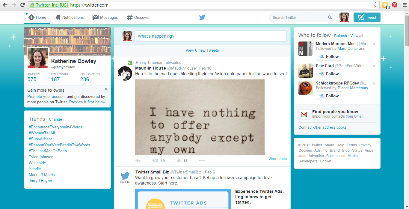
Photo 5 on Twitter:
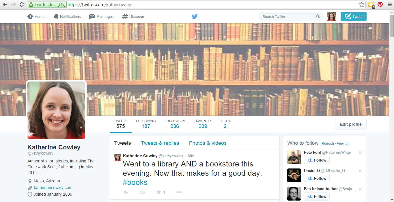
And when it’s shown smaller:
Both photos looked good on Twitter. But in the context of a social media site, I preferred Photo 4.
So despite the fact that I am going to make 47% of respondents unhappy, I’m going with Photo 4. However, I plan to use Photo 5 if I ever need an alternate photo.
My other photos are awesome too. For instance, the turquoise background photos look really good when they aren’t cropped into a headshot, so I will surely use them for something.
Thanks to everyone who participated in the Great Author Photo Debate of 2015!
I voted for 4 and 5, but I didn’t take into account a social media use. I like 5 for a book insert but 4 definitely looks better on the web. Congratulations!!